Let’s be honest—your sign might be the first thing people notice about your business. Whether it’s a big storefront sign or a simple banner, it speaks before you do.

A great sign says, “Come in, we’re awesome.” A bad one? It might say, “We don’t really care.” And no business wants that.

So if you’re wondering why some signs work better than others, or if you want to make sure your signage is doing its job, this guide is for you. Let’s go over some of the most common signage mistakes businesses make—and how to fix them.

People Can’t Read It

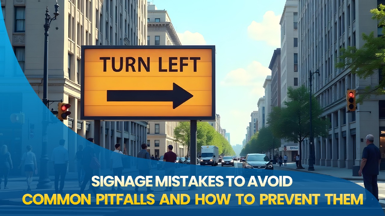
It’s likely that you have seen signs that appear cool but are difficult to read. It may be fashionable to use fancy fonts, unusual colors, or small letters, but what good is it if no one can read what you’re writing?

Here’s how to improve it:

Don’t use fancy fonts; instead, use bold, readable ones.

Maintain a high contrast between the text and background colors (black on white, for example).

Make your lettering bold, especially for signs that will be viewed from a distance.

Remove the words.  A straightforward message is always successful.

Consider this: a person driving or walking by should be able to understand your sign in roughly two seconds.

There’s Just Too Much Going On

Ever seen a sign that’s packed with text, images, offers, and logos all at once? That’s a lot to take in—and most people just won’t bother.

Too much information can actually do more harm than good. Instead of helping, it overwhelms.

Keep it clean by:

  • Sharing one message per sign.

  • Breaking content into pieces if you have lots to say.

  • Leaving space—your design needs room to breathe.

  • Letting the most important message stand out the most.

Simple is powerful. A sign that says “Fresh Coffee Inside” is often more effective than one listing 20 different drinks.

It Doesn’t Match Your Brand

Let’s say your signage appears plain and antiquated, but your Instagram is bright and contemporary. People may become confused by that disconnect.

You should feel like yourself in your signs. They ought to be consistent with the tone, colors, and voice of your company.

To maintain consistency:

All signs and marketing should use the same fonts and colors.

Where appropriate, include your logo.

Make sure your signage reflects the fun nature of your business.

Consumers should feel that everything fits together after recognizing your sign from your website or social media accounts.

It Looks Cheap or Worn Out

Everybody has seen signs with faded letters or peeling corners. Even though it might not seem like much, it can give the impression that your company is closed or unprofessional.

Durability is important, but good signage doesn’t have to be expensive.

Better choices consist of:

materials for outdoor signs that are resistant to weather.

UV-protected inks to maintain the vibrancy of colors.

protective coatings to prevent fading or scratches.

Maintaining your signs demonstrates that you value both your company and your clients.

It’s in the Wrong Spot

Even if you have the most attractive sign in town, it won’t help you if it’s obscured by a tree or placed in a window where nobody can see it.

Here’s how to resolve that:

If at all possible, place your sign at eye level.

Verify that there are no obstructions, such as vehicles, vegetation, or clutter.

Examine its appearance both during the day and at night.

If people need to see it after dark, add lighting.

Go outside and take a look before posting a sign. Would it be obvious to a stranger?

You Didn’t Check Local Rules

Every city has different rules about signage. Some limit the size, the lighting, or where you can place signs.

Skipping this step can lead to trouble—like fines or being told to take your sign down.

Play it safe:

  • Ask your city or town office about sign permits.

  • Talk to a local sign company—they often know the rules.

  • Don’t install anything permanent without permission.

A little research can save you a lot of time and stress later.

No One Knows What to Do Next

Sometimes signs just state a name or logo—and that’s it. While that might look nice, it doesn’t guide your customer.

Good signs should also suggest an action.

Try this:

  • Add a call to action like “Stop In,” “Order Now,” or “Call Today.”

  • Include helpful info like a phone number or website.

  • Add a QR code if you want people to scan and learn more.

Even something small like “Walk-Ins Welcome” makes your sign more useful.

It’s Old or Out of Date

We’ve all seen it—a faded “Holiday Sale” banner still hanging in spring. Or a restaurant menu board that hasn’t been updated in years.

That kind of thing makes people wonder if your business is active or even open.

Keep it fresh by:

  • Checking your signs every few months.

  • Replacing anything that’s worn, outdated, or no longer accurate.

  • Updating seasonal messages quickly.

If you want total control, digital signs let you change things instantly—and that’s a big plus.

There’s a Typo

One little typo can make your business look careless. It happens more often than you’d think—and once a sign is printed, it’s expensive to fix.

Avoid this by:

  • Proofreading carefully—don’t rush it.

  • Having someone else look it over too.

  • Printing a test copy before the final version.

Spelling counts. It’s worth the extra 10 minutes to get it right.

It Doesn’t Speak to Your Customers

Think about who your audience is. If you’re running a fun toy store but your signs look serious and plain, something’s off.

Your signs should feel like they’re talking to your people.

Make sure they:

  • Use language and colors that fit your customer base.

  • Feel welcoming and approachable.

  • Are easy to understand, even for people with different reading levels or vision.

You want people to see your sign and think, “That’s for me.”

If you change your messages often or run lots of promotions, digital signs are a smart move. You can update them instantly—no printing, no waiting.

They’re great for restaurants, salons, events, or anywhere you want flexibility.

Benefits include:

  • Showing rotating messages or menus

  • Adding motion or video for more attention

  • Scheduling messages to change by time or day

They cost more up front, but many businesses see quick returns in foot traffic and sales.

Wrapping It Up

Your signs say a lot about your business—even when you’re not there to explain things yourself. They can invite people in, guide them to take action, and leave a great impression.

Or… they can confuse, overwhelm, or turn people away.

Luckily, most signage mistakes are easy to fix. Keep it simple, clear, on-brand, and updated—and your signs will start doing exactly what you want them to do.

Because when your sign says the right thing, the rest gets easier.

Post a comment

Your email address will not be published.

Related Posts