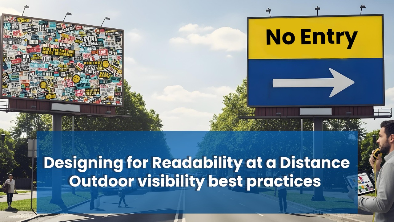
Have you ever passed a sign that caused you to squint and wonder, “What did that say?” Most likely, you didn’t look back to learn. That’s precisely why it’s so crucial to design for readability from a distance.
From across the street or across the parking lot, your message must be very clear whether you’re posting a billboard, street sign, or storefront banner. We’ll go over the essential advice in this post to make your outdoor signage not only noticeable but also impossible to ignore.
Why Clear Signage Matters (More Than You Think)
In a world where attention spans are shorter than ever, outdoor signs only get a few seconds to make an impression.
Here’s what poor readability could be costing you:
Missed business because people couldn’t read your offer in time
A confusing or forgettable brand image
Lost trust — if your sign looks sloppy, what does that say about your business?
Consider your signage to be your on-call salesperson. It isn’t doing its job if it is difficult to read.
What Actually Makes a Sign Readable?
1.Font Size: Bigger Really Is Better
This one’s easy to overlook. But the rule is simple:
One inch of letter height = 10 feet of readable distance.
That means if your sign is going up 100 feet away from where people are, your letters better be at least 10 inches tall. Also, stick to clean, simple fonts — no fancy cursive or hard-to-read decorative ones. Think Arial, Helvetica, or Futura.
2.Color Contrast: Make It Pop
Your text needs to stand out from the background. High-contrast combos like black on yellow or white on blue are perfect. Red on green? Not so much.
The higher the contrast, the faster people can process what your sign says — especially from a distance or on the move.
3. The Right Colors Send the Right Message
Colors can say a lot about your brand: Red grabs attention fast (clearance, urgency) Blue feels trustworthy and calm (banks, healthcare) Green says eco-friendly or healthy Yellow = energy, warmth, happiness Also, think about color blindness — roughly 1 in 12 men are affected. Using high contrast and testing your sign in grayscale can help make sure it works for everyone.
4. Letter Spacing: Keep It Comfortable
Crammed letters are just as bad as letters spaced too far apart. You want just enough breathing room so people can read the words without having to decode them. Proper spacing makes everything easier to read, especially from far away.
5. Say It in Six Words or Less
If you can’t boil it down, it’s too much. The best outdoor signs get straight to the point:
“Now Open – Drive Thru Coffee”
“25% Off – This Week Only!”
“We Repair iPhones – Fast!”
Think of your sign like a tweet — short, punchy, and designed to stop someone in their tracks.
Don’t Forget the Environment Around Your Sign
A. Where and How It’ll Be Seen
Is your sign eye-level or high above a freeway?
Will people be walking by, or driving past at 60 mph?
Will it be seen head-on or from the side?
All of this changes how big your text should be and how simple your design needs to be.
B. Time of Day and Lighting
Your sign must function equally well at night. This could entail utilizing reflective materials, installing LED lighting, or staying away from glossy finishes that glare during the day.
C. Weather
Your sign must withstand the sun, rain, and snow. No matter the weather, your message will remain readable thanks to UV-resistant inks, waterproof materials, and non-glare finishes.
1. Use a Visual Hierarchy
Not everything on your sign is equally important. So make the most important thing — like your offer or business name — the biggest and boldest.
2. Give It Room to Breathe
White space isn’t wasted. It gives your sign a polished appearance and directs attention to the important details. Signs that are crowded seem disorganized.
3. Keep Branding Consistent
Coordinate the design of your sign with that of your menus, flyers, website, and even social media accounts. In this manner, people will recognize you when they see your sign. Trust is developed via familiarity.
Real Examples That Got It Right (or Wrong)
FedEx trucks: Big, bold font. Clean design. Instantly recognizable.
McDonald’s: Yellow arches, red background, minimal words. You know what it is in a blink.
Overloaded real estate signs: Too many words, tiny fonts — a common fail. People drive by confused instead of calling.
Real Examples That Got It Right (or Wrong)
Perform a Print Test: Can you read your design when you stand far away and print it to scale?
Create a Mockup: Position your sign on a real-world background using an editing tool.
Examine a chart of legibility: To make sure you’re on target, use the letter size guidelines provided by ANSI or OSHA.
How to Determine Whether Your Sign Is Effective
Perform a Print Test: Can you read your design when you stand far away and print it to scale?
Create a Mockup: Position your sign on a real-world background using an editing tool.
FAQ: Your Top Signage Questions, Answered
At least 10 inches tall for easy readability.
Try black on yellow or white on blue — great for outdoor visibility.
More than 6–8 words, and you’re losing people’s attention.
Go with a clean sans-serif font like Arial, Helvetica, or Futura.
Yes! Rain, sun glare, and fading can all make signs hard to read. Go weather-resistant and test in different light
The goal of outdoor signage is to be seen, read, and remembered, not to be ostentatious.
These guidelines will help you make signs that truly accomplish their goals of drawing attention and inspiring action: large, bold fonts, clever color contrast, and straightforward messaging.
Before you press “print” or scale that ladder, consider whether someone fifty feet away could read this sign in less than three seconds.
If so, you’re spot on.
Related Posts
Copyright and Trademark Considerations for Signage: Protecting Creative Assets
Signage is a powerful tool for branding, marketing, and audience engagement. It is more than…
The Best Signage Company in Dubai: Key Features to Look For
On a warm evening in Dubai, Amal, a young entrepreneur, stood outside her soon-to-open boutique…
Light Box Signage: The Secret Weapon for Retail Stores
Walk into any modern mall, and you’ll notice something fascinating. Even with hundreds of stores…
How to Choose the Right Signage Material to Boost Your Business Success
Your business signage isn’t just a display—it’s your silent spokesperson. Whether it’s catching the eye…


