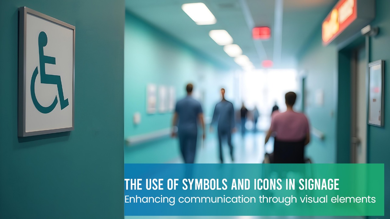
Let’s Start with Something Simple
Have you ever been at a train station, mall, or airport and not known where to go? Perhaps everything seemed strange to you, or perhaps you didn’t speak the language. Then you saw a picture of food, a bathroom symbol, or a small arrow. You suddenly knew where to go.
Icons and symbols accomplish that. Without having to read a word, they assist you in understanding the message.
These are constantly present, frequently going unnoticed. To keep things going, though, they’re working very hard behind the scenes.
Why Pictures Work Better Than Words
Words are wonderful, but let’s face it, reading them takes time. But pictures? They are immediately absorbed by our brains. Because of this, a simple symbol can accomplish the same task more quickly than a complete sentence.
Imagine an exclamation point next to a red triangle. It means “watch out” or “warning,” and you don’t need anyone to tell you that. Your brain simply knows.
This is particularly useful in settings where people speak different languages. For nearly everyone, a picture of a bus, a phone, or stairs represents the same thing.
What Makes These Little Icons So Helpful
So why are icons everywhere? Because they’re smart, quick, and easy. Here’s how they help:
- Saves time – You spot it, understand it, and move on. No thinking required.
- Takes up less space – You don’t need a paragraph when one picture does the trick.
- Works in emergencies – When there’s no time to read, symbols can literally save lives. They make signs better, simpler, and friendlier to everyone.
You See These Every Day (Even If You Don’t Notice)
Let’s look at a few you probably know:
Arrows – Tell you where to go.
Bathroom signs – Pretty universal.
Exit signs – Especially useful in emergencies.
Food or coffee icons – Lead the way to a break.
No-smoking symbols – Easy to recognize anywhere.
These are just a few. They’re part of everyday life now, like traffic lights or crosswalk signals.
Designing Good Icons Isn’t as Easy as It Sounds
Making a symbol isn’t just about drawing something small. There’s a bit of an art to it. Here are a few rules that designers follow:
Keep it super simple – If you need to explain it, it’s not working.
Stick with one style – Don’t mix cartoonish icons with sleek modern ones.
Test it out – Ask regular folks if they understand it.
Color matters – Red means stop or danger. Green usually means go or safe.
Put it where people will see it – Don’t hide it in a corner.
A good icon does the job without making you stop and think.
Don’t Forget Culture
Many people overlook the fact that different symbols have different meanings depending on the context.
For instance, giving someone the thumbs up is considered polite in some nations but positive in the United States. The same is true of gestures and animals; what is considered normal in one place may be considered odd or offensive in another.
Therefore, it’s wise to research how a symbol is interpreted in different cultures, particularly if your sign will be viewed by people from different countries.
More signs are going digital these days. You’ve seen them—screens at airports, shopping centers, or even bus stops.
The cool part? These signs can change based on time, location, or events. For example:
A sign might show a blinking exit during a fire drill.
A mall directory might point you to a sale.
An airport screen might flash an icon when a flight is boarding.
Just like with printed signs, the same rules apply: simple, clear, and easy to spot.
When Icons and Branding Work Together
Some companies create their own icons to match their style. You’ve probably seen this at stores like IKEA or in apps like Google Maps.
They use visuals that feel like their brand—friendly, clean, or quirky—but still easy to understand.
This helps with:
Building trust – People know what to expect.
Making navigation easier – Especially in big spaces.
Creating a smoother experience – No one likes to feel lost.
Icons can actually make a company feel more helpful.
Making Signs Work for Everyone
Not everyone sees things the same way. Some people have trouble with vision, reading, or understanding symbols. So, signs need to be designed with everyone in mind.
Here’s how:
Use high contrast (like black and white).
Don’t just rely on color—shape matters too.
Add a word or two if needed.
Include braille or raised textures for blind users.
Avoid complicated or fancy designs.
Good design helps people feel included. And honestly, it just makes things better for all of us.
Places That Use Icons Really Well
Let’s talk about a few real examples:
Tokyo’s subway – It’s huge and confusing, but smart use of colors and symbols makes it easier—even for tourists.
IKEA – Their signs are simple and the same everywhere.
Airports – Baggage claim, customs, and boarding gates are all marked with helpful icons that travelers understand right away.
These are proof that thoughtful icon design really works.
Common Mistakes People Make
Even good ideas can go wrong if you’re not careful. Here are a few things to watch out for:
Too many icons at once – That just creates noise.
Unclear or weird symbols – If it makes people stop and ask “What’s that?”—it failed.
Inconsistent design – Mixing styles or meanings just causes confusion.
Keep it clean, keep it clear, and always test your designs with real people.
In the near future, signs will get even smarter. Imagine:
Your phone showing icons through a camera (AR)
Signs that change language based on who’s nearby
Screens that update in real-time, like during emergencies
No matter how advanced things get, one thing stays the same: icons will still be one of the best ways to share information fast
Final Thoughts
Despite their small size, icons have a lot of meaning. They make it a little easier for us to navigate the world, whether it’s locating a restroom, identifying an exit, or comprehending a rule.
Basic symbols….. Significant effect.
Give it a little credit the next time you see one; it could have prevented tension, saved you time, or even kept you safe.
Related Posts
Signage Installation Dubai: Complete Process, Cost & Timeline Guide
Signage Installation Dubai: Complete Process, Cost & Timeline Guide Introduction Dubai’s skyline is powered by…
What Makes a Good Shop Signboard in Dubai? 7 Design Rules That Drive Foot Traffic
Walk through any commercial strip in Dubai Jumeirah, Deira, Al Karama, Business Bay and you’ll…
Why iDesign Advertising Is the Best Signage Company for High Quality Business Signboards
In today’s competitive market, every business needs strong visibility. A well-designed signboard is often the…
Designing for All Ages: Inclusive Signage Strategies for the UAE’s Year of the Family (2026)
The UAE has officially declared 2026 as the Year of the Family – a national…
