Related Posts
April 27, 2026
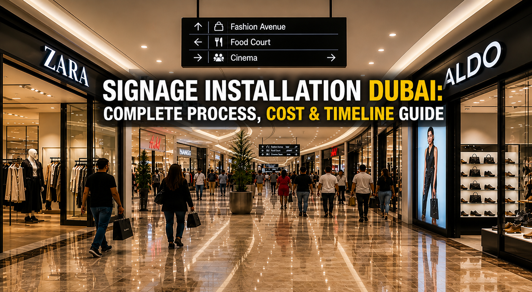
Signage Installation Dubai: Complete Process, Cost & Timeline Guide
Signage Installation Dubai: Complete Process, Cost & Timeline Guide Introduction Dubai’s skyline is powered by…
March 25, 2026
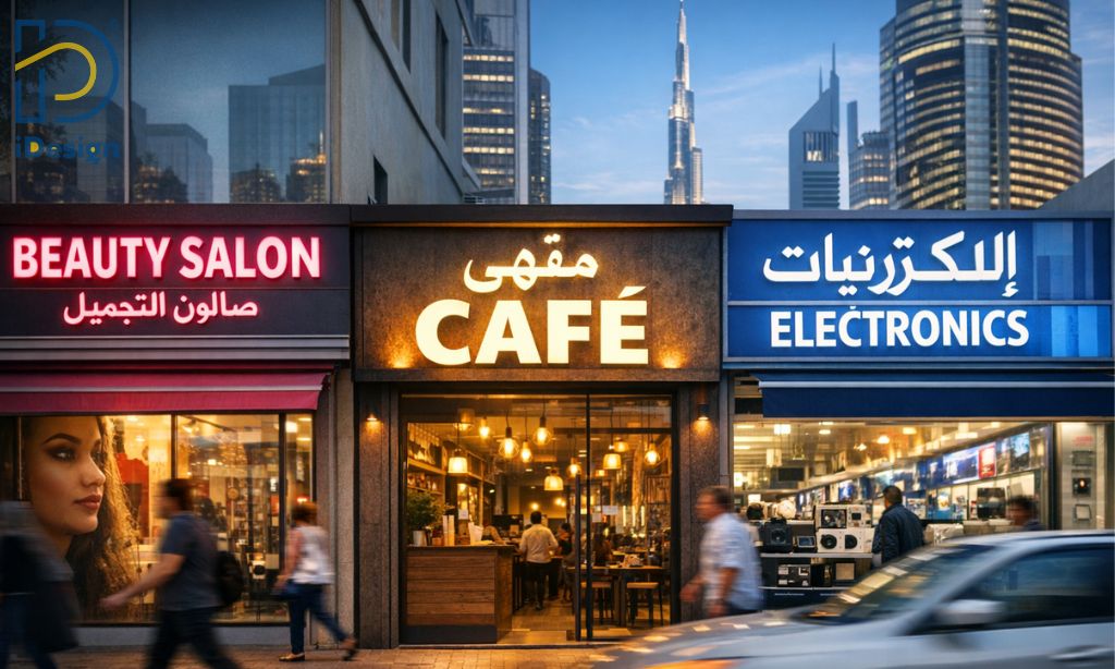
What Makes a Good Shop Signboard in Dubai? 7 Design Rules That Drive Foot Traffic
Walk through any commercial strip in Dubai Jumeirah, Deira, Al Karama, Business Bay and you’ll…
March 24, 2026
Why iDesign Advertising Is the Best Signage Company for High Quality Business Signboards
In today’s competitive market, every business needs strong visibility. A well-designed signboard is often the…